After many delays, the next major release of Coppice is almost ready. I'm still putting the finishing touches to it but Coppice 2021.2 should hopefully be out in the next few weeks.
2021.2 is focused on improving navigation and linking within Coppice. I've also had the opportunity to use Coppice more intensively the past few months. While I've used Coppice throughout its development, this more recent use highlighted a bunch of smaller fixes and improvements that should make using Coppice a lot more enjoyable. So let's take a closer look!
Redesigned Page Selector
The Page Selector is used in many places in Coppice. It can be used for jumping to a Page, adding a Page to a Canvas, and linking to a Page. The initial design was quite narrow with large rows for each search result.
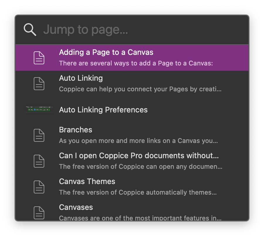
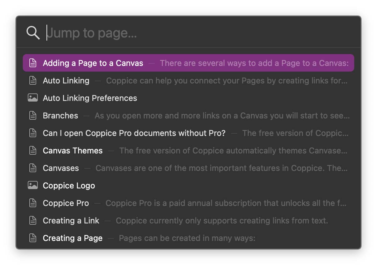
Part of the reason for these large rows was to allow for a preview of Image Pages. Unfortunately, these previews were rather small and not particularly useful, so I've decided to get rid of them. This opened up the potential for reducing the height of each row by moving everything into a single line, letting you see more results in the same space.
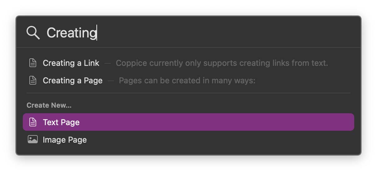
The next big feature added to the Page Selector is the ability to create Pages. Every Page Selector now has a list of options at the bottom. Selecting one of these will create a new Page, title it with what was entered in the search field, and then perform whatever action you were wanting to do. This makes things like creating a link to a new page far easier, and I can't wait for you to get your hands on it.
Link Inspector
Linking is one of the key features of Coppice. Since its release, Coppice has been pretty good at letting you create links (even helping find links for you). But the UI for editing and removing links left a bit to be desired, and there wasn't really any way to view where a link points without clicking on it and seeing what popped up.
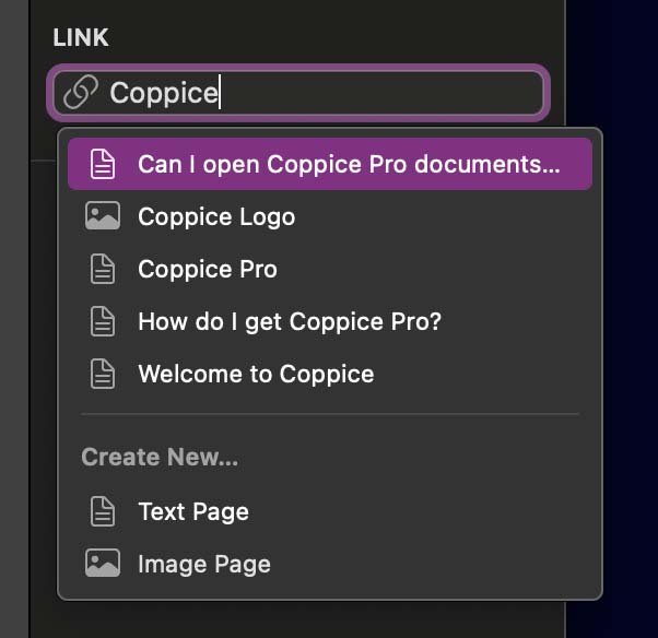
To solve this, I've added a new inspector: the Link Inspector. This inspector only contains one control, but it is incredibly powerful. If you select a link it will show it in the inspector. To change a link you can click the Link Control and start typing. Select one of the suggestions and the link will be updated. And to remove a link simply click the x button to the right of the Link Control.

The Link Inspector does more than just let you link to existing pages though. The auto-complete is actually a variant of the Page Selector so gains the same ability to create new pages. On top of that, you can start typing a URL to add an external link, no longer needing a separate sheet.
Quality of Life Improvements
As I mentioned above, I've been using Coppice a lot more over the past few months and realised there were a few areas where I could make small changes which improve Coppice in big ways:
You can now duplicate Pages, either from a context menu or by holding option when dragging Pages in the side bar. Text Pages now support tables. This adds a lot more flexibility in how you lay out Pages. The Welcome View now lets you drag documents out of its sidebar. This is great for when you want to make a quick copy of a document without opening it or having to search for it in Finder.
There are also numerous bug fixes, including:
Changing the font size or weight now works more reliably Auto-linking no longer links Pages to themselves and now works with smart quotes Ordered lists now start at the correct number
Pro Features
Finally, Pro users are getting some improvements. The first of these is in the new Page Selector, where you can hold down the option key to display the folders a Page resides in, great for when you have multiple Pages with the same name.
You will also find two new options in the inspectors. The first is the ability to exclude a Page from auto-linking. Sometimes you create Pages to act as templates, or maybe they have a common word as their title that is linking too often. Well now you can exclude them with the click of a checkbox. And for those who want to see Page titles permanently on a Canvas, there is now a checkbox to make sure they're always visible, without needing to hover over the Page
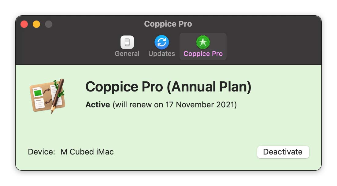
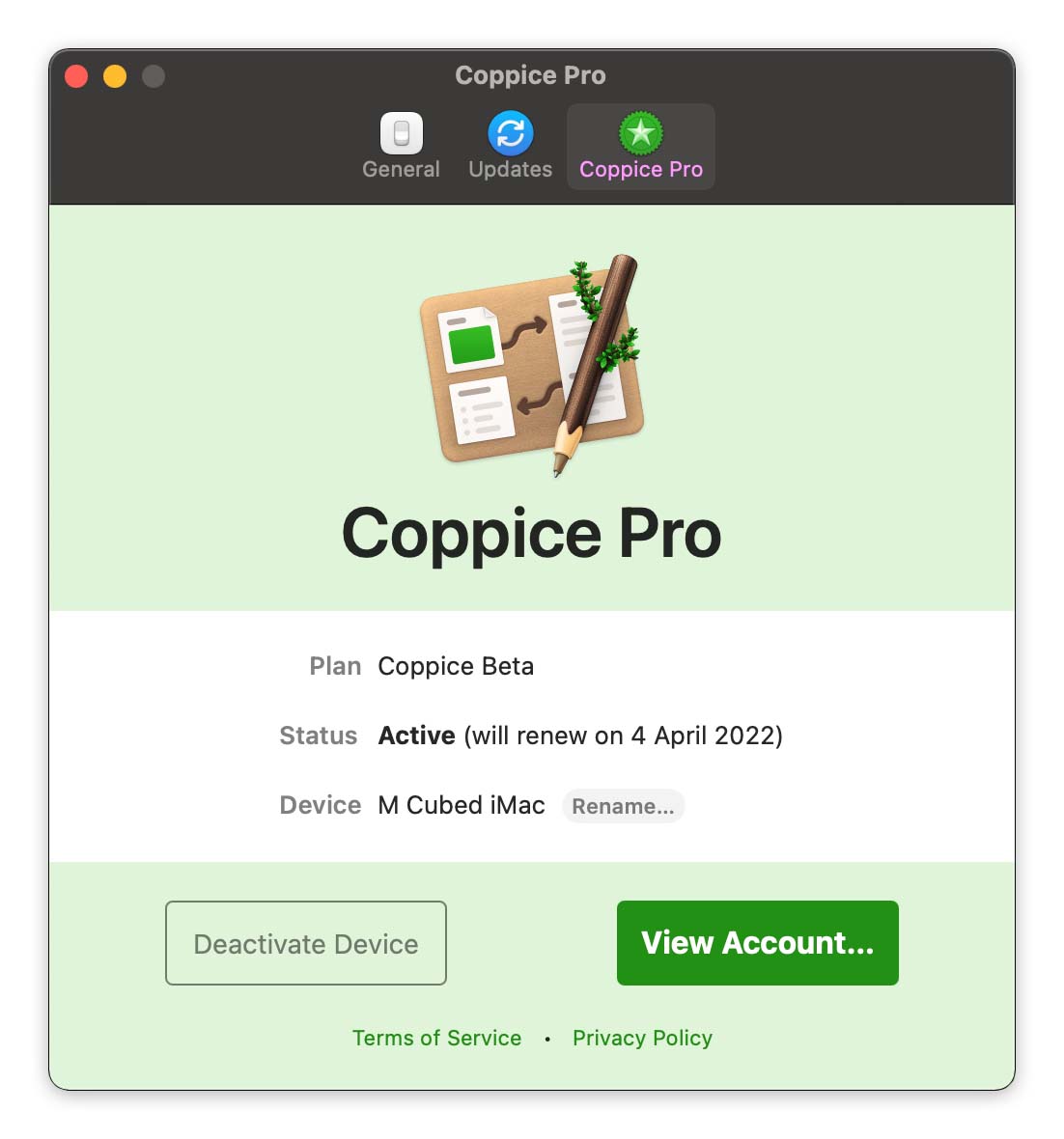
Finally, I've redesigned the Coppice Pro screen in preferences. Previously, logging into your M Cubed Account to activate Pro left you with a screen that was a bit plain and awkward to parse.
After a quick redesign, everything is better laid out, with additional options such as taking you to your M Cubed Account online.
There are still a few more bugs to fix and various support documents to update, but I'm hoping to be able to get Coppice 2021.2 and all these great new features out to you in the next few weeks. If you want to be the first to know when it's released, then be sure to subscribe to The Coppice Blog or follow @mcubedsw on Mastodon.