Back in October I wrote about how I wanted to be more transparent about the development of Coppice. There are several ways I'm wanting to do that, but the one I'm focusing on today is a new series of posts called the Dev Diary. This will be a monthly account of what work I managed to get done on Coppice, be that design, development, marketing, or anything else around building and selling an indie Mac app. So let's get started with January's edition.
Recovering from 2021
After the release of version 2021.2 I was feeling dangerously close burnt out. I took the decision to take the whole of December off from working on Coppice, and then take two full weeks off all development work over Christmas. Burn out is a dangerous thing, especially for an indie developer. I've learnt the hard way that it's far better to tackle it early to save yourself in the long run.
Thankfully, after this rest I'm now feeling a lot happier, healthier, and more enthusiastic about working on and improving Coppice, which bodes well for the rest of the year.
Starting Streaming
The first thing I worked on this month wasn't actually Coppice itself, but a live development stream. This is a place where people can tune in to watch me work on Coppice live, and bring comments and questions for me to answer as I work. It's another pillar of my transparency strategy and one that is also helping keep me motivated and focused on the task at hand.
Most of the work this month was just building the initial stream setup and getting used to the software, but I'm pretty happy with how things are going. I'm planning a more in-depth post next week, but you can check out the stream (including VODs of old streams) over at twitch.tv/pilkycrc.
Starting Version 2022.1
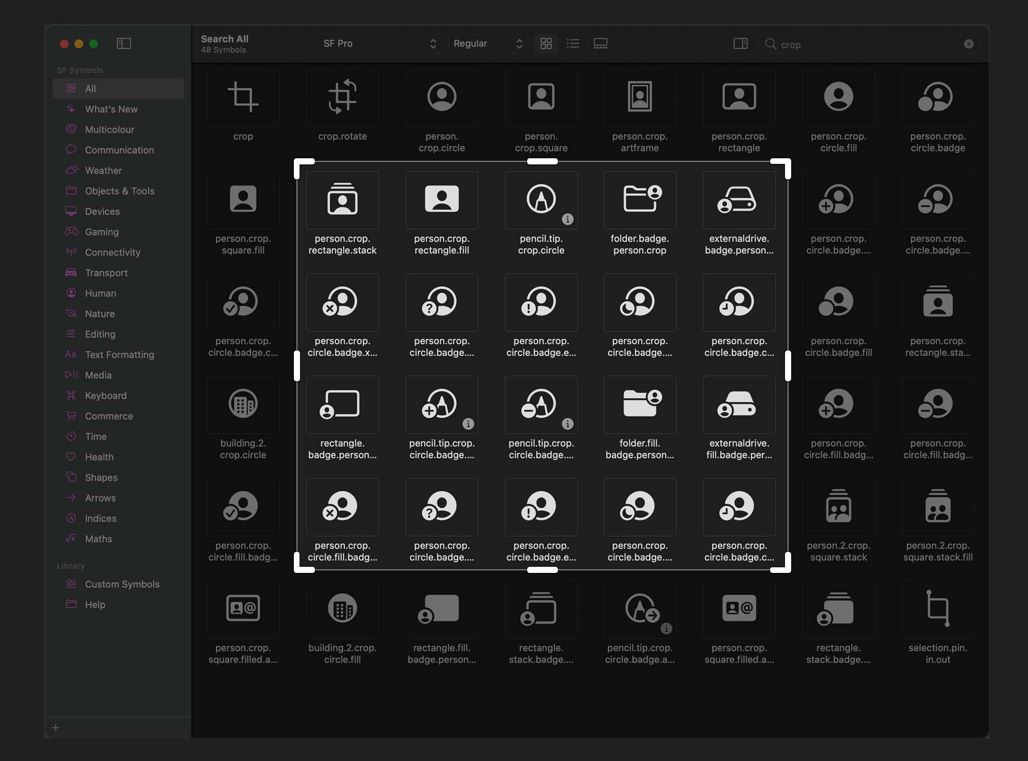
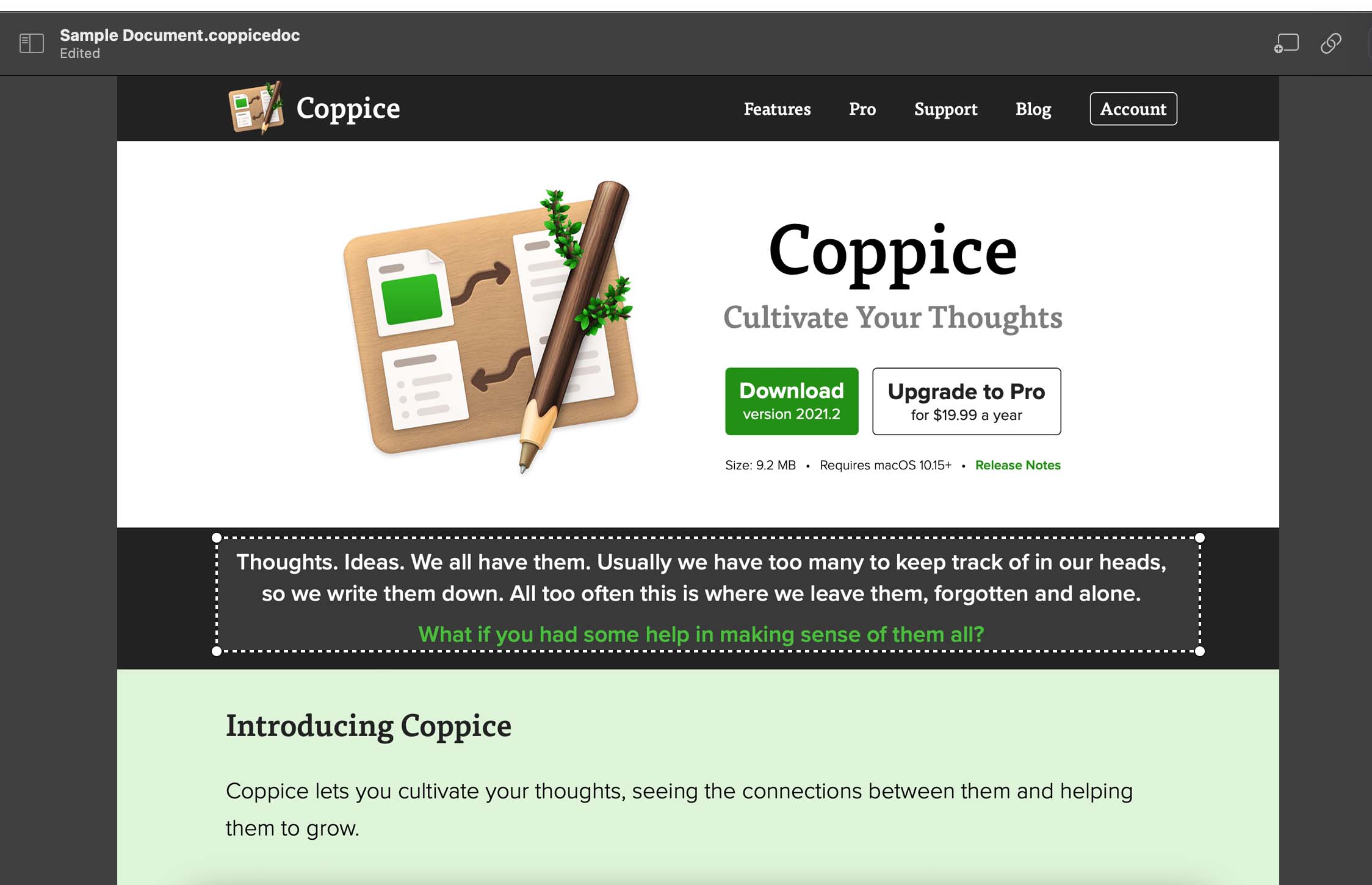
The next big version of Coppice is version 2022.1. This will focus heavily on improving the functionality of image pages. The two key areas I'm working on are some basic image editing tools, such as rotate and cropping, and the ability to create links from image pages to other pages.
I've already managed to get the rotation functionality built and have made a good start on the cropping functionality. The latter is going to take a lot more time than I anticipated as there are lots of small UX problems to solve.

I've also started building out the designs around how linking hotspots might look, though this may take a bit longer to implement. One enjoyable thing about this whole version is it's pushing my graphical coding abilities beyond my usual comfort zone, allowing me to explore parts of Apple's APIs I haven't had opportunity to touch in the past.

That will do it for this month's dev diary. As always, if you want to stay up to date on Coppice then be sure to subscribe to The Coppice Blog and follow @coppiceapp on Twitter.