Coppice has been under development for close to a year and its interface has undergone many design changes over that time. We had finally got the interface into a state we were happy with a few months ago and were expecting to ship with that interface this Autumn. Then along came Apple with WWDC…

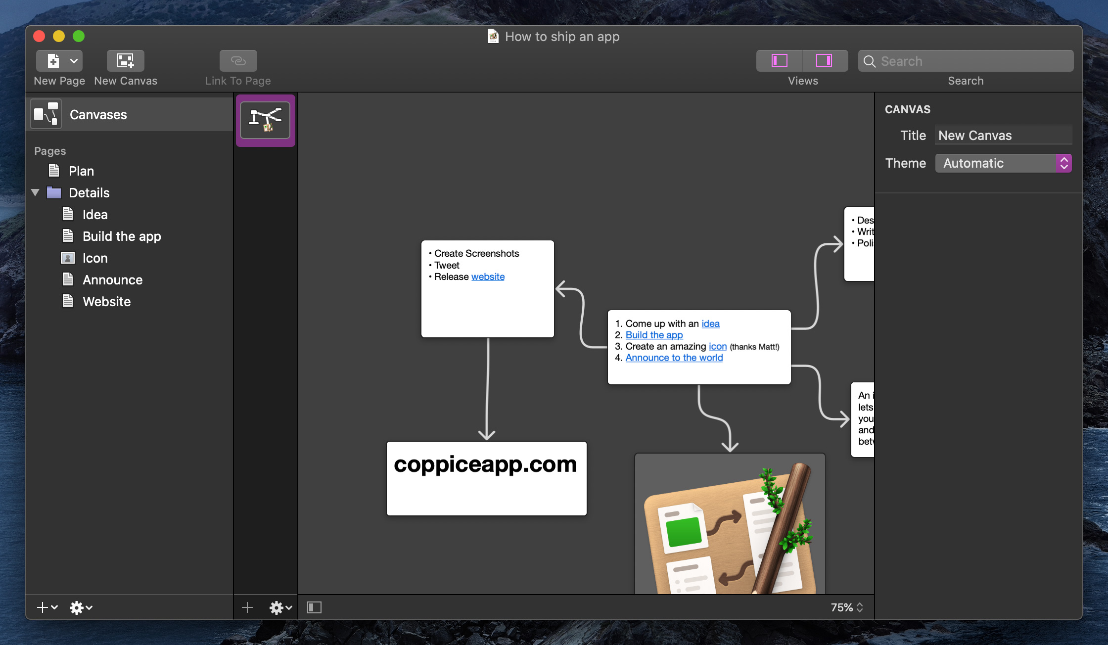
Coppice, running on macOS Catalina prior to WWDC 2020
Every developer goes into WWDC week expecting that they'll have to make some changes to their apps. There are the inevitable bugs that new OS versions introduce, and the new platform features to implement. And then, every so often, Apple decides to completely redesign the visual appearance of the OS.
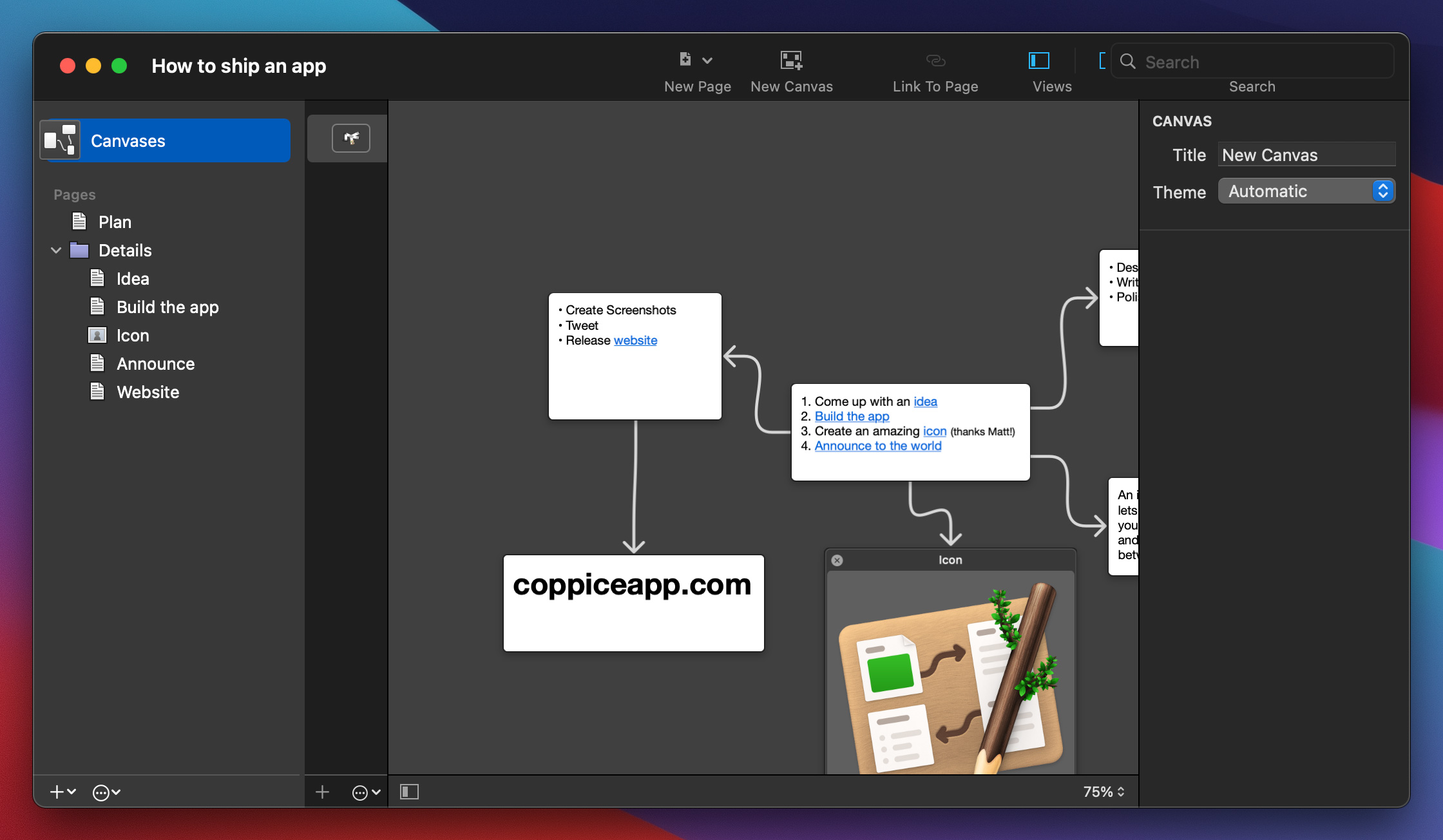
The first thing to do when this happens is install the new beta OS and launch your app to get an idea of the damage. Thankfully, in Coppice's case, it wasn't too bad. As you can see in the screenshot below, most of the UI updated just fine.

Coppice, re-compiled to run on macOS Big Sur with no changes
The bulk of the work that needed to be done was with the sidebar and the toolbar. In simple cases, icons and controls were just misaligned. However, Big Sur is not just a visual update to sidebars and toolbars, but also updates how these work, and what counts as "standard" behaviour.
First, the sidebar. Big Sur makes a full height sidebar the new norm. This was thankfully a relatively easy thing to implement and makes a huge difference to fitting in with the new aesthetic. Besides a few bugs fixes not much else had to change.
Next, the toolbar, which represents the biggest change. Previously a window had a title bar, containing the window's "traffic light" buttons and the title of the window, and a toolbar full of controls below the title bar. In Big Sur these can both be merged into one.
The first change we made was to break up the sidebar/inspector toggles. Previously the convention was to have such controls grouped together, but Apple has moved them to the left and right sides of the toolbar in their apps with Big Sur.
Next, we looked at the New Page control. One of the changes to Big Sur is developers can link toolbar items to panes in a split view. In our case this allows us to move the New Page button to above the source list in Big Sur.

Top: initial toolbar after building for Big Sur Bottom: final toolbar for Big Sur.
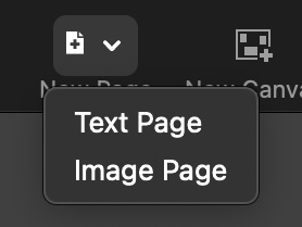
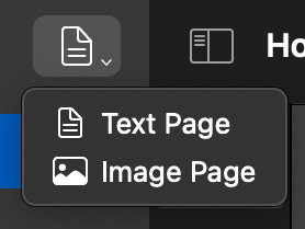
We also took this opportunity to rethink how the control works. Previously you could click on it and get a menu to select the page type. This is great if you're wanting to make pages of different types, and the final version of the control still works this way if you click and hold on it. However, it made creating many pages of the same type just that little bit harder. To fix this we made it so that simply clicking on the button will now create a page of the same type as the last page you created. It's an example of how having to redesign for a new OS can help improve things for users on older OSes too.


Left: The old create page control Right: the new create page control
Finally, we have the icons. Apple has built up a large collection of icons for developers to use over the past few years called SF Symbols. These help to give a more consistent look and feel to the platform. With Big Sur, Apple has brought this collection of icons to the Mac.
We wanted to replace the icons in Coppice with these new icons. Unfortunately though, they don't work on macOS Catalina. To work around this we decided to re-create the icons ourselves, so we can keep them consistent across platforms. We also added some of our own, such as for the Canvases item in the sidebar.
This also had another benefit. Traditionally, icons like this have been designed to perfectly align with pixels on your screen. This helps keep them crisp, clear, and easy to understand. Unfortunately, Apple's new icons are designed to be infinitely scalable, which means they don't do this pixel alignment. This isn't too bad at large sizes, but at the sizes required for use in most apps it can lead to them looking very blurry, especially on non-retina displays. By re-creating the icons ourselves, we were able to fix this issue, so they should look crisp no matter what Mac you run on.

SF Symbols (the top row of icons) vs manually re-created icons (the bottom row)
In case it is a bit hard to see the difference, here is the same image scaled up. Note that in both cases these images show non-retina versions of the icons.

So that is some of the work we have done to help make sure Coppice is ready for Big Sur from day one. Be sure to subscribe to the Coppice Blog, sign up to the Coppice Mailing List, and/or follow @mcubedsw on Mastodon to stay up to date on Coppice's development.